BEFORE & AFTER
CLICK EACH PHOTO FOR AN EXPANDED VIEW
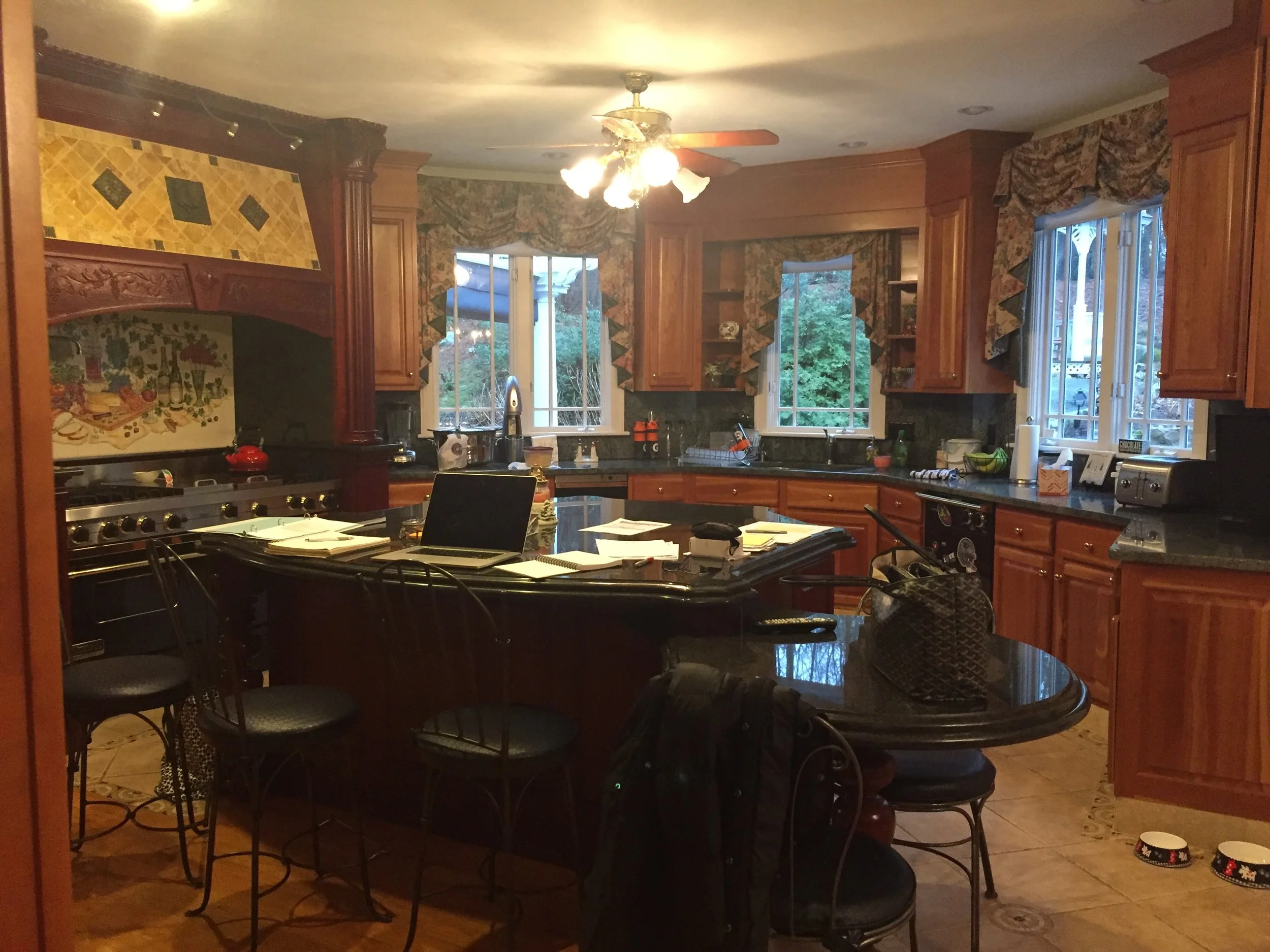
The challenge for this dated kitchen was to increase the light from the south facing windows and to work within the angled walls. To make the kitchen feel lighter, the windows were split apart and custom off-white cabinets were installed. The glass sliding cabinet doors allow for light reflection, while the mostly white iron stone pottery presents a cohesive palette. The polished marble counter tops on the island and perimeter bounce light and the darkly stained floor reflects the light upward.
The homeowner wanted to keep the well-made built in bookcases and wainscoting. By painting them a semi-gloss off-white and applying a dark stain on the hardwood floors, the room feels open and inviting. The silk wallpaper gives texture and softness to the glass and metal, while the leather grounds the entire room.
The challenge of this kitchen was to unify the cabinetry and to add much needed light. Counter to reason, by removing a window and reorienting the range and island, the new off-white cabinets and quartz countertops unify the space and reflect more light around the room. The new darker stained floor also reflects the light upward, lending added brilliance to the space.
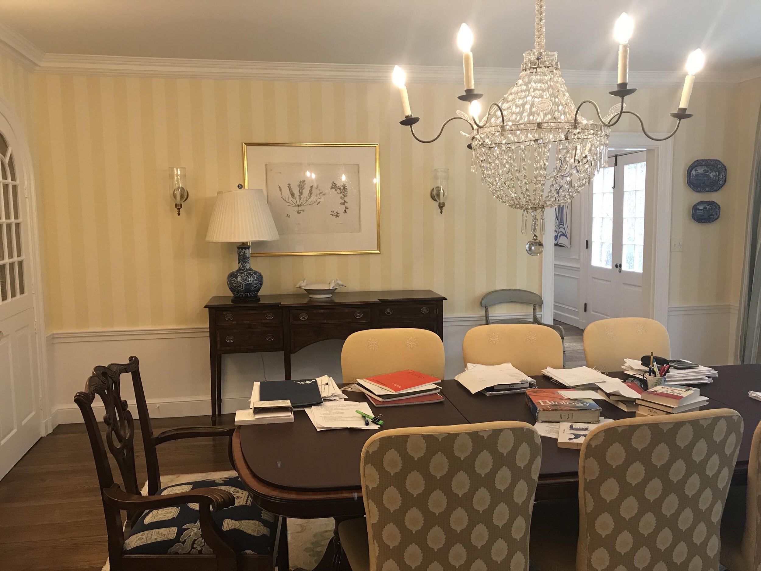
This dining room has everything going for it. The proportion and architectural detail were a fabulous jumping off point. My clients love all shades aubergine, so we added a stunning, light reflective wallpaper that changes as you walk though the room. The dining chairs are upholstered in a luscious velvet, complimenting the violet and deep red of the drapes. The custom hand-woven rug grounds the space in a geometric pattern.
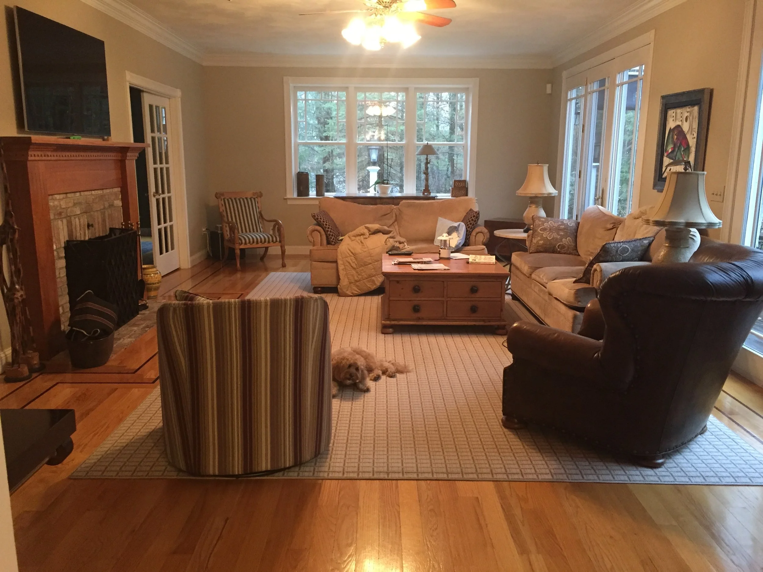
The challenge with this family room was to provide seating for a family of six, plus friends, while leaving the wall color in tact. By unifying the color palette through the furniture and adding softness to just one set of windows, the family room is ready for lounging and watching tv.
The challenge for this kitchen was to make it larger without expanding into the backyard. The kitchen was small and overwhelmed by the dark cherry cabinetry and a low 7’-5” ceiling. With the homeowners blessing, we pushed into the dining room and moved the doorways. The increased space and new door placement set the stage for a sublime renovation. We used off-white cabinetry and crown moulding throughout, while reflective glass doors with polished nickel hardware invite even more natural light.
The challenge for this kitchen area was the low ceiling and dark wood trim. The homeowner wanted to update the walls and gain some storage space. By removing the window grills and wallpaper and unifying the space with color and crown moulding, the ceiling doesn’t appear low. And by refinishing the table and adding new, comfortable seating, the family can appreciate the wood burning fireplace from the table or the new window bench.
This outdated family room, with oversized furniture, didn’t appeal to the family any longer. By removing the window grills, painting the walls, trim and boxing in the ceiling beams, we were able to present a cohesive palette. Now with ample seating and a clean design, the family can enjoy time together.
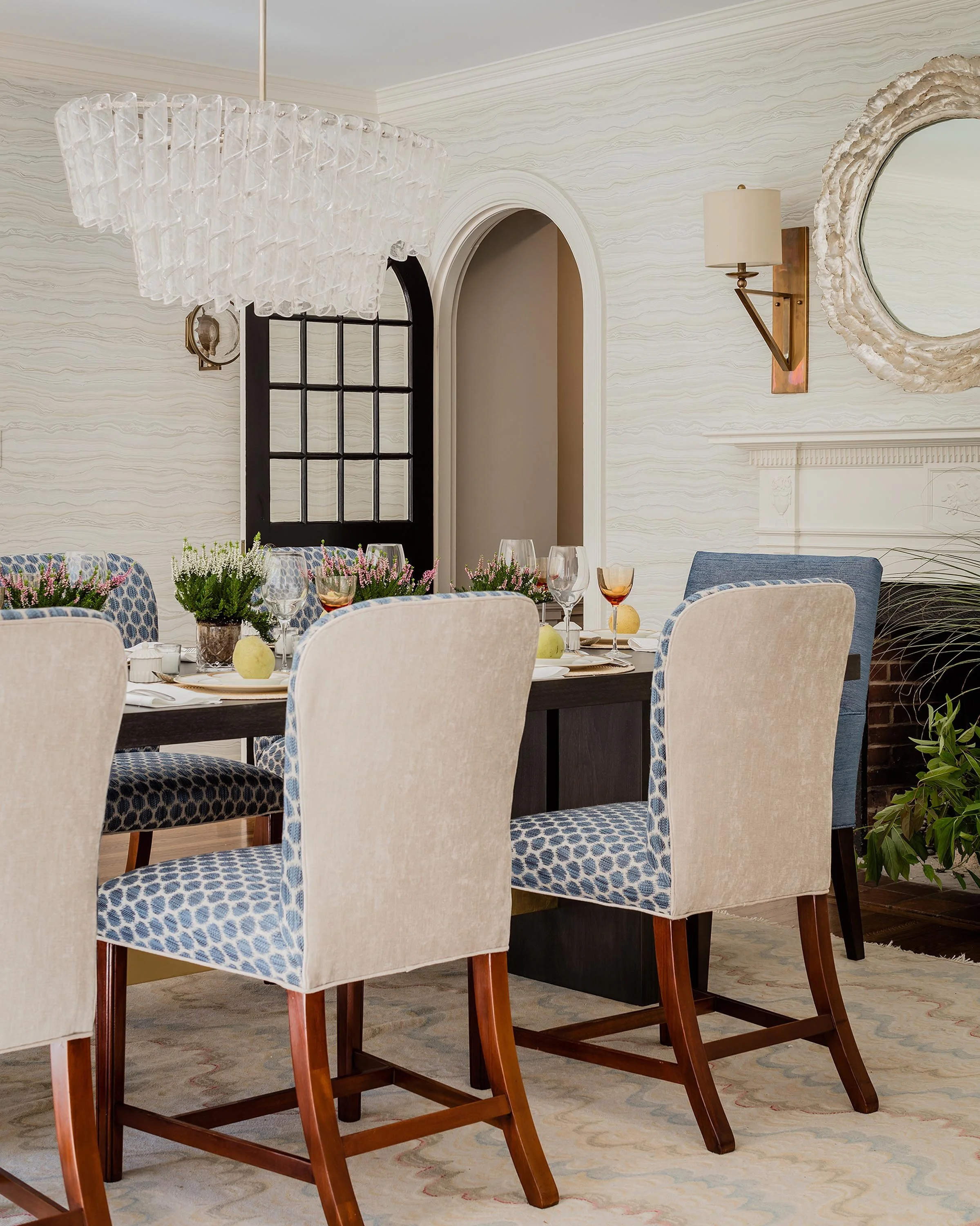
This gorgeous dining room needed only a cosmetic update, the lines of the room were already perfect. We removed the out-of-scale wood paneling to take the wallpaper from floor to ceiling. The existing rug and the newly reupholstered side chairs were pressed into action and jump started the design decisions. A new modern table with a burnished gold table stretcher informed the decision to use brass on the wall sconces, while we switched up the chandelier and added a little sparkle with glass and silver. The entire room shimmers thanks to the wallpaper, mirror and in-laid capiz shell credenza.
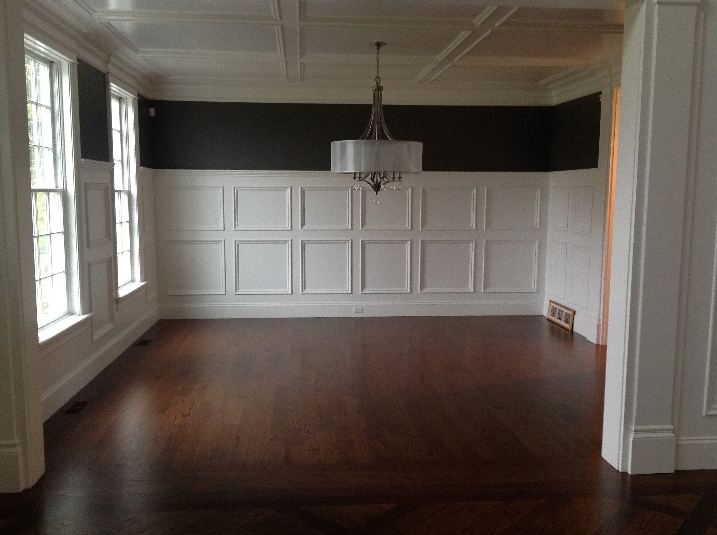
The challenge for this dining room was the gold painted crown moulding and the gold painted picture-frame paneling. The homeowner wanted traditional wainscoting, so we removed the wallpaper and simple wood paneling and replaced it with built-out wainscoting in the appropriate scale. Additionally, we added fabric-backed wall covering and a traditional crystal chandelier. Finally, we stained the hardwood a custom dark walnut to enhance the homeowners cherry dining table.
DESIGN HIGHLIGHTS
Fine design comes down to fine details.
One of my favorite design elements is birds’ beak shelving. The precision woodworking makes for a stunning shelf display. Instead of many small holes and plastic holders, you simply adjust the shelf by moving it to a different “beak.”
I like to mix finishes and materials. In this case, the metallic silver wallpaper keeps the space feeling light, while the navy and teal fish wallpaper feels playfully aquatic.
This pass-through butler’s pantry benefits from floor to ceiling cabinetry and a crackle finish backsplash. I love taking wallpaper up onto ceilings, creating a “fifth wall” and unifying the space.
Ah, texture. My guiding principle for this Show House office was to have the eye see what the hand can feel. The Japanese paper weave wallpaper is deeply textural and 3-D, while the sea grass photographs provide a visual softness. The console is covered in raffia, the leather box is shagreen texture and the basket speaks for itself.
One of the most common questions I’m asked is, “What’s your style?” In a way, a Show House can be the purest expression of a designer’s point of view, as the design of your home will begin with your needs and desires.


